A short word at the end of a line is a reason to compare two arrangements, not an automatic reason to shrink the headline. Make a copy of the layout, change the break, and keep the version that reads better at its actual size.
What is actually hanging
Here, “hanging” means a preposition separated from the phrase that follows by a line break. It is unrelated to the grammar of ending a sentence with a preposition:
Built for
your next campaign
Read the phrase as a whole. If the break causes no hesitation and the block fits, it may need no correction. A language-specific house style can still require a change; judge its effect in the complete layout.
The fix has a cost
A non-breaking space between “for” and “your” keeps those words together. In a narrower box, the result might become:
Built
for your next
campaign
The Unicode line-breaking specification describes the mechanism: a non-breaking space removes a wrapping opportunity. It does not choose a better composition for you.
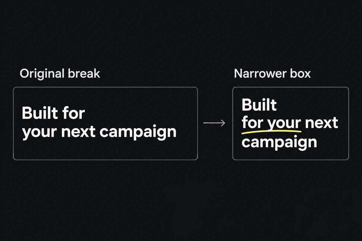
Try the smallest correction first: keep the required words together, adjust the text box within the available space, or use shorter approved wording. Compare the resulting line count and text size before keeping it.
A tidy desktop break can fail on mobile
A manual break remains when the container narrows; the next phrase may then wrap again. For a responsive page, resize through the supported widths and enlarge text using the site's normal accessibility controls. For a fixed export, inspect each required format separately.
Keep a deliberate break only where it survives those conditions. Remove it when normal wrapping produces the clearer block. See multi-format adaptation for arrangements that need to change with the frame.
Review the cost of the correction
Compare both versions without zooming in. Does the new break make the phrase easier to read? Did it add a line, reduce the type, crowd the product or move the CTA? Preserve required word groups, such as a number and its unit, while resolving those costs.
If neither version works, revise the wording or composition rather than repeatedly gluing words together. The ad typography guide covers size, hierarchy and contrast when the problem is larger than one break.